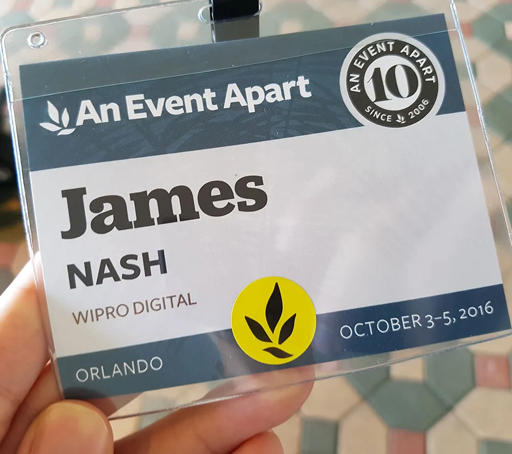
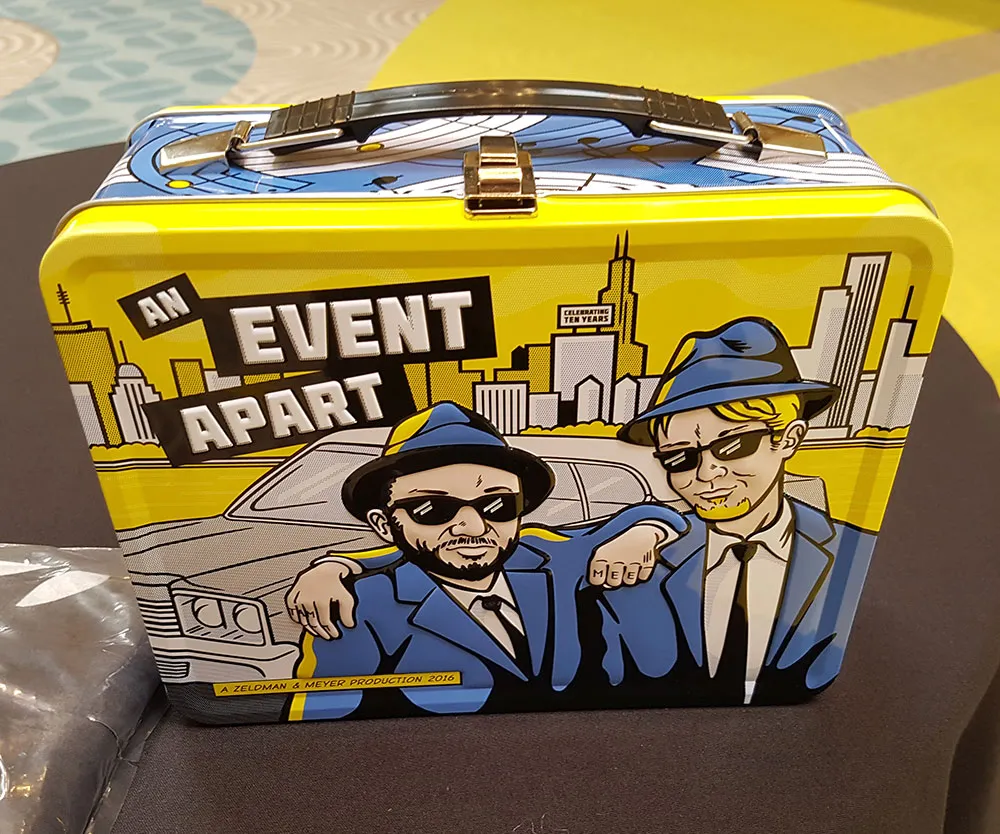
Back in October I had the good fortune of being able to attend the excellent An Event Apart 2016 Orlando, a three day web design conference. The speakers were all well known and highly respected figures in the web design community. The kind of people who have literally written the book on everything from web standards over Responsive Web Design through to the latest CSS animation and layout techniques.
While all the talks were interesting in their own right, I couldn’t help but notice how a handful of underlying principles and themes emerged again and again. These are all things that I have come to value and apply to my own web work over the years, so I was chuffed to see such esteemed speakers share the same ideals.
Web design and development is characterised by rapid and constant churn. Languages and browsers evolve, frameworks and libraries come and go, aesthetic styles go in and out of fashion and companies rise and fall. Amongst all that it can be difficult to spot and extract the valuable principles that will stand the test of time. The kinds of things that were good ideas years ago, are good ideas today and will most likely still be good ideas many years from now.
From several of the conference’s talks, here are a few such principles that stood out for me…
Style guides are now standard
Whenever any of the speakers touched on the process of actually designing and building a web experience, style guides got a mention. However, they weren’t called out as a newfangled, fancy way of doing things — rather, they were always mentioned matter-of-factly, as if to say: Of course we employ style guides, that’s just how we do things.
As someone who’s never been comfortable with static Photoshop comps and who’s actively been advocating the use of style guides at work for some time now, I couldn’t agree more. Nonetheless, it is incredibly reassuring to see that style guides really have established themselves as an integral part of our web design and development craft.
As this approach begins to scale beyond individual projects, organisation-wide Design Systems are emerging as the next big thing we need to focus on. Your UI style guide is now one component in a wider eco-system. Mr “Atomic Design” himself, Brad Frost, did a great talk on the ingredients and approaches needed to establish a successful Design System.
Progressive Enhancement is as important as ever
In a similar vein to style guides, Progressive Enhancement was repeatedly mentioned or shown as the de facto way we should be crafting web experiences. When discussing code, speakers invariably began with the careful choice of the most appropriate, semantic mark-up that would represent the information or functionality in the simplest possible form. Only then would CSS be added, including thoughtful styling fallbacks for cutting-edge CSS features. Finally they pointed out how the experience could be further enhanced using JavaScript.
As Jeremy Keith reminded us in his talk, Progressive Enhancement is very much about robustness. HTML is — by design — the most forgiving and also the most resilient of the languages we use. It is also the first thing the browser downloads, so, if for any reason that ends up being all that your users receive, it makes sense to ensure that it can at least provide the core experience. With that solid foundation in place, you can then enhance it as far as you like (or your budget allows).
By the way, Jeremy Keith has since published an excellent — and free — web book on this subject: Resilient Web Design.
There’s more to UX than what you see
We live in a golden age of developer tools and frameworks. However, as much as they make our own lives easier, they by themselves will not aid the end user’s experience. We still need to be mindful of how our design and development choices can affect the user experience.
I often find that UX discussions focus primarily on the visual user interface and neglect many of the non-visual aspects of the experience such as: Performance, accessibility, reliability and coping with edge-cases. It was therefore refreshing to see so many talks highlight these topics.
Lara Hogan gave a great talk on performance and various techniques we can employ to improve our page load times. One noteworthy tidbit from that talk was the fact that 40% of users will abandon your site if it takes longer than 3 seconds to load. If that’s not proof that performance is an integral part of the user experience, I don’t know what is!
Derek Featherstone encouraged us to practise “extreme design” — i.e. design for the edge cases amongst our spectrum of users. As he pointed out, if we solve a design problem for an extreme case we don’t just make the experience accessible to those specific users, we frequently produce an experience that is better for everyone.
Device Agnosticism… duh!
When Tim Berners-Lee laid the foundations for what would become the Web, he was driven by a desire to allow scientists at CERN working on different kinds of computers, with different operating systems to share information with each other. These days we have a much greater diversity of devices accessing the Web, but the underlying principle that being agnostic to the user’s choice of browser, OS and device enables the broadest possible audience is as old as the Web itself and still every bit as important. Those that heed that principle and work with it rather than against it will reap its benefits.
People who used to build fluid layouts had a much easier time migrating to responsive layouts than those that were producing fixed-width, absolutely positioned, 960px layouts.
People who assumed their users would or wouldn’t do certain things on mobiles were proven wrong (and yet many made the same mistake again when tablets became mainstream). Meanwhile, those that didn’t artificially limit what users could and couldn’t do on their sites based on device were rewarded with more views, conversions and customer satisfaction.
A couple of talks looked at how to the Web is now evolving to incorporate even more devices. In “the Physical Interface”, Josh Clark showed many examples of how internet-connected gadgets and sensors are enabling us to expose and interact with Web resources in exciting, new ways. He also highlighted some of the ethical challenges we will need to grapple with when working with these things.
Cameron Moll’s “Unified Design” explored how to provide our users with a consistent experience across all our web experiences as well as any other touch points we provide them with. Just working on any device is no longer enough. Users increasingly expect to be able to perform tasks across devices. He called out Progressive Web Apps as an area to watch, as they are one way that you might provide such services.
For me, these talks also reinforced the value of being device-agnostic: If your thinking, planning, designing and building has been device-agnostic, then you already knew that these developments were inevitable. None of this will come as a surprise and you’ll be ideally positioned to embrace the next wave of devices joining the Web (whatever they may be) and create amazing services across them that will excite your users.
Conclusions
Of course many interesting topics were covered beyond the few I’ve picked out above. For instance, thanks to Rachel Andrew and Jen Simmons, I’m now super excited about CSS Grid support landing in mainstream browsers this year. As they explained and demonstrated, it can be applied today as a progressive enhancement to your current designs. Heh. There I go again pointing out those underlying, timeless principles!
While most presentations from this conference are not publicly available, a ton of supplementary materials are. Plenty of videos of talks from various An Event Apart conferences are also available.
Overall, I was very impressed by the conference. The speakers and talks were excellent. The venue was lovely (hell, we were next door to the Magic Kingdom!). The food was tasty and the swag was cool. It was educational, inspirational and fun.
The speakers are also very approachable. Being able to say hello to some of the people who have influenced so much of how I think about and work with the Web was a real treat for me!
If I ever get a chance to attend An Event Apart again, I’d do so in a heartbeat!