
We’ve been applying Atomic Design to various client projects for well over a year now at Wipro Digital & Buildit. In that time we have learnt a lot and it’s high time we shared that with you.
So, pour yourself a coffee, grab a cookie and get comfortable — this is gonna be a big one…
First steps
Our first foray into Atomic Design simply moved us away from static designs to a fully responsive style guide website (with some help from the excellent Pattern Lab tool). We were now working directly in the medium.
That in itself was already a huge leap forward. No more unexpected layout surprises between breakpoints, since we could easily resize and stress-test our evolving designs as we went along. No more faffing about with manually versioning and trying to share large image files and documents, we simply pushed our code to git and had a build server publish the updated style guide site to a URL. All our clients and developers had to do was hit the reload button in their browsers.
For this first project, we did not attempt any kind of code sharing with the off-shore development team who were building the “real” website. Instead, they would look at our style guide site, much like they would have looked at a PSD file before, and then wrote their own code to replicate that design. That being said, I like to think that being able to “View source” in our style guide gave them the occasional hint or inspiration that got carried over into their own code.
The completed “real” website ended up looking pretty close to our designs. Certainly more so than if we had delivered them as static images. Of the discrepancies we did have, some were due to constraints of the content management system (CMS) the developers had to work with — you can’t always mould the HTML output as freely as you’d like! Others were due to tweaks or changes that the client requested from the development team only but did not feed back to the design team.
Nonetheless, our first venture into Atomic Design land was a success. Our client was happy and asked us back to expand on the style guide website to add new components and templates. Furthermore, we had proven to our colleagues, our client and ourselves that this was indeed a great approach.
Getting smarter
On that first project, we just dove right in. We began with the starter kit patterns that came bundled with Pattern Lab (it was still version 1.x back then) and began hacking those Mustache files to suit our needs. We setup a few LESS files that we added new styles to whenever they were required. We diligently checked every change to our source code into a git repository, but we weren’t especially strict about how and when we’d create or merge branches.
When the client asked us to come back for round two, we took stock of our source code. Our Mustache files weren’t as well organised and named as they could be and, as a result, there was some duplication —i.e multiple patterns doing (almost) the same thing. Our LESS files had become large and unwieldy. Also, even with our small and co-located team, a number of different naming conventions and code layout styles had emerged. How and when we created branches in git was also a bit ad-hoc and sometimes meant work on one UI component would be blocking completion of another. Coupled with the large LESS files, merges were sometimes tricky too.
Even though we were a team comprised of designers-with-coding-skills and developers-with-design-skills, we had thought of our work up to that point first and foremost as a design deliverable. We now came to the realisation that this was very much a software project and, as such, it should follow good software engineering practices.
We therefore agreed on:
- Conventions for organising our source code
- Conventions for coding style (naming conventions, indentation style, etc.)
- Conventions for UI patterns
- A branching model for our version control
- Creating a backlog to capture and track the individual tasks we needed to do
Unsurprisingly, this was a big help.
As our existing code was gradually refactored to follow our new conventions, we found we could add or update UI components more easily. Sharing work or re-assigning tasks when someone was off or busy with other projects was also much easier. As was bringing new staff onboard.
As with any software project, you should carefully choose or create your own conventions based on your team’s preferences and the tools you are using. Brad Frost has since written a great post with advice on how to establish front-end guidelines for your team.
That being said, below are the conventions we settled on. Feel free to use or draw inspiration from them as you see fit. If they don’t suit your needs and you settle on something else, that’s cool too. I’d encourage you to share your own ones with the world too though — the more we share, the more we all learn from each other and improve.
Code organisation
We wanted to make it easy to find the LESS code that related to a particular Mustache pattern and vice-versa. Pattern Lab already gave us a folder structure for our patterns, so we decided to mirror that in our LESS code:
# Mustache file:
_patterns/01-molecules/10-things/42-foo-pattern.mustache

# Corresponding LESS file (if one is needed)
less/patterns/01-molecules/10-things/42-foo-pattern.less
Now we had a one-to-one mapping and related code was super easy to locate. We could have kept our LESS files in the same directories as the Mustache ones, but chose not to so that each directory wouldn’t get overly cluttered with lots of files. YMMV.
Note: We barely had any JavaScript code for this project, so we didn’t adopt a similar rule for that. However, on a more recent and JavaScript-heavy project, we have followed the same convention for our JavaScript source code and it worked well.
Coding style
For the basics like indentation, CSS class names, ordering of CSS rules, etc. we adopted Mark Otto’s lovely Code Guide. We liked that it’s short, simple and not overly prescriptive. We also set up an .editorconfig file to ensure that everyone’s editors and IDEs used the correct settings.
We decided to always organise our CSS media queries in a mobile-first way. First, code outside of a media query sets the styles and layout for the smallest viewport size. We then add successively larger min-width media queries that override only the properties that need to change.
We’ve found that this reinforces the mobile-first mindset when designing and developing UI components, which is great and helps keep everyone involved focussed. It also tends to lead to more succinct CSS. You’re only coding up the deltas as you cross each breakpoint, which usually aren’t all that much. Elements shuffle around a bit and perhaps resize, but colours, typography, margins, etc. tend to remain unchanged.
Finally, we imposed the following rules for our molecules, organisms and templates:
- Every pattern’s name is globally unique
- Every pattern has a single, outermost HTML element.
- This outermost element must have a class name that matches the name of that pattern
- In the corresponding LESS file, everything is nested within a class selector for that pattern’s class name.
Putting it all together, you end up with something like this:
42-foo-pattern.mustache:
<section class="foo-pattern">
  <h2></h2>
  <img src="" alt="">
  <p>
    Check out the totes amazeballs
    <a href=""></a>
  </p>
</section>42-foo-pattern.less:
.foo-pattern {
  /* Box model */
  ...

  /* Typography */
  ...

  /* Visual */
  ...

  /* Misc */
  ...

  /// MEDIA QUERIES ///
  @media (min-width: @breakpoint-small){
    ...
  } @media (min-width: @breakpoint-medium){
    ...
  }
}
Since the pattern names are unique, this helps isolate styles for one pattern from interfering with others. It’s not completely fool-proof since you could for instance have element selectors that inadvertently also apply to elements of included patterns. It worked well for our needs though and we very rarely encountered that scenario. Besides, it’s easy to resolve such issues using CSS’s > child selector.
One thing to be aware of with responsive styles for individual components, is that media queries are relative to the viewport. Imagine you have a UI component that can be laid out in different ways —perhaps one vertical layout suitable for narrow spaces, and one horizontal layout for wider spaces.
If the available space is determined by the viewport width, using media queries to switch between the layouts is fine. However, if the same component is included within other components, it could find itself contained in a narrow space on a large screen, e.g. it might be sitting within one of several columns. Responding to the viewport width would not be appropriate in that case.
In the future we might get CSS element queries, which would be the perfect solution to this. Until then, we came up with the following work-around though: Instead of using media queries, a UI component can expose the CSS rules it would have applied within a media query as a mixin. Containing components can then apply those mixins within their media queries as needed.
Let’s imagine our fictitious “foo-pattern” above normally displays in its natural, vertical layout. Heading, image and text with link all stack in a single column. In a wider space, we may want to put the image and text side-by-side. We could therefore do something like:
// 42-foo-pattern.less
.foo-pattern {
  // Base styles for narrow, single column layout
  ...

  // No media queries here. Move along...
}

// Expose mixins
.foo-pattern-wide-layout() {
  /* Box model */
  overflow: hidden; // Crude clearfix

  // Make image & text go side-by-side
  > img,
  > p {
    /* Box model */
    width: 50%;
    float: left;
  }
}
By itself, “foo-pattern” will now always be laid out vertically. However, any pattern that includes it can apply the mixin to override that as it sees fit.
Imagine we have a “bar-pattern” that includes three “foo-pattern” instances. On small screens, they just lay out vertically, one after another. However, on wider screens we want to switch the first one to its horizontal layout to make better use of the extra space. Furthermore, we want to lay the remaining two out below it side-by-side. Since each only occupies half the screen width, we leave it in its vertical layout.
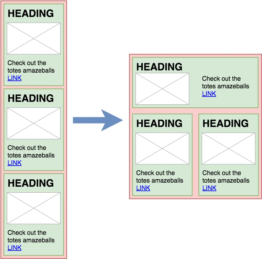
This now becomes very easy to do. Our code for the “bar pattern” might look something like this:
99-bar-pattern.mustache
<div class="bar-pattern">
  false
  false
  false
</div>
99-bar-pattern.less
.bar-pattern {
  ...
  /// MEDIA QUERIES ///

  // Switch to π layout on sufficiently wide screens
  @media (min-width: @breakpoint-medium){
    .foo-pattern:nth-child(1) {
      // Apply layout mixin
      .foo-pattern-wide-layout();
    }

    // Make remaining foo-patterns layout
    // into 2 columns
    .foo-pattern:nth-child(n+2) {
      /* Box model */
      width: 50%;
      float: left;
    }
  }
}
Conventions for UI patterns
We’ve already touched on some pattern conventions like globally unique names. However, in addition to the ones motivated by coding concerns, we identified some other useful characteristics:
- Patterns that are block elements should not set a width (or, if necessary, set a 100% width) so that they always expand to fill the width provided by their parent element
- Patterns that are block elements should not have outer margins
- Patterns must never contain overflowing elements
Sticking to these rules, really helped the reusability of our UI patterns. You can always include another pattern, safe in the knowledge that it won’t have awkward layout side-effects.
Another beneficial consequence of these rules, is that:
- It is always the responsibility of the parent pattern to layout any child patterns it includes.
In other words, if something needs to be floated, given a width other than 100%, positioned, put into a flexbox, etc. etc. — it will always be the containing pattern that does so. Having clearly defined responsibilities like that makes it easy to know where to look or add code when working with the patterns — especially when you’re in a team and often work with code written by others.
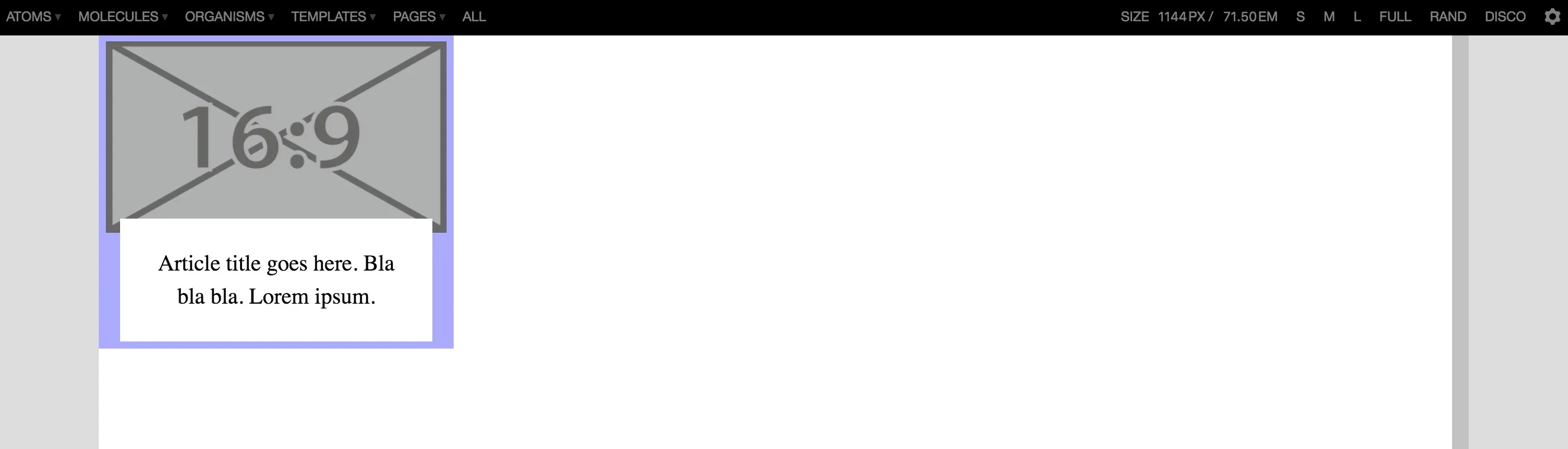
One, sometimes undesirable, side-effect of this approach is that, when viewed individually inside Pattern Lab, UI patterns that are intended to be contained with columns on a page appear excessively large.
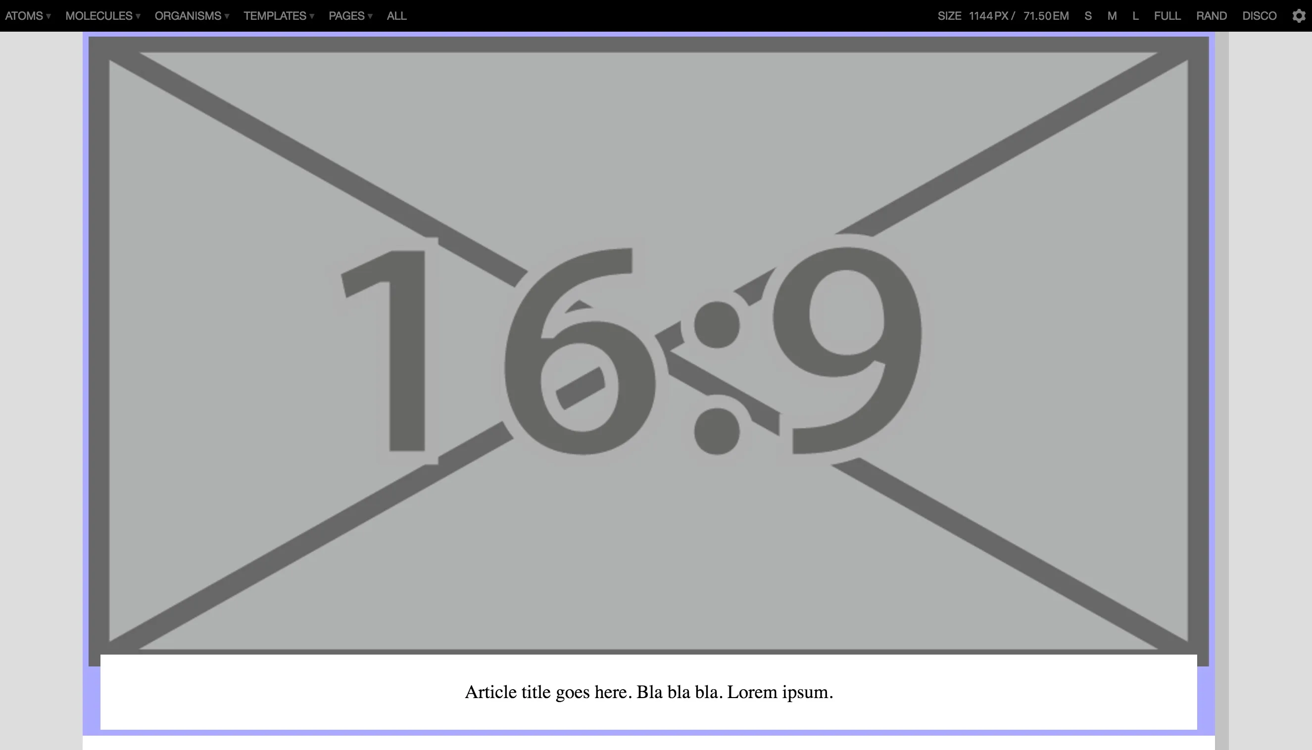
While it might not bother us since we know we’d never actually use the pattern in that way, this can sometimes be a bit confusing to client stakeholders trying to review the UI components.
Fortunately, there’s a simple work-around. Have an extra CSS file that is only used within the style guide which imposes some suitable size constraints. When Pattern Lab generates the HTML for your style guide, it will always place your pattern’s markup either as a child of <div class="sg-pattern-example"> (for any of the “View all” pages) or as a child of <body> (for pages that show individual patterns). We can exploit this fact by doing something like:
/* styleguide.less */

.sg-pattern-example,
body {
  /*
    Style guide specific work-arounds go
    in here. Don't forget to use the child
    selector though, so you don't break
    normal usage of your patterns.
  */

  > .bar-pattern {
    /* Box model */
    max-width: 300px; // Appropriate display size
  }

  ...
}
Then, when viewed in within the style guide, the UI displays in a more appropriate size:
We’ve used the same technique to work-around other issues that can arise when wanting to visually showcase UI components individually, outside of their usual context. For example, we had a modal component (based on Bootstrap’s modal) which is normally hidden by default and only appears via some user-initiated action like a button click. Using our styleguide.less we could override that to force it to be visible when viewed individually inside the style guide.
Branching model for version control
Rather than rolling our own, we decided to follow the Git Flow model. We liked that:
- It was well documented and easy to pick up
- Some tools like SourceTree have built-in awareness of it
- Giving each feature its own branch means that their respective changes are independent and delays on one task don’t block another
- It got us thinking about versioning our releases (more on that in a future post!)
There’s nothing more to say about that really. Having a branching convention like that definitely helped things run more smoothly.
Introducing a backlog
On our first project, which was relatively short, we handled requirements and reviews with our client stakeholder informally via email and Skype. That worked fine until there were changes in the team. New people joining in from either side had a hard time catching up with all the agreements and tweaks that had been discussed but not captured in a single, easy-to-find location.
For our next project we therefore setup a backlog of tasks in JIRA (mainly because that’s what was readily available to us — it could have just as easily have been Trello or any other similar tool) and basically did a light version of the whole agile thing.
In return for a little bit of admin overhead, we had a clear picture for us and the client of what was being worked on and by whom, what discussions on individual tasks had occurred, what was ready to be reviewed by the client, etc. etc. This obviously made it much easier for newcomers, or any outsiders with an interest in the project, to get an overview of what was going on.
We also started to capture data of how long it was taking us to complete UI components, allowing us to estimate future work more accurately.
Chasing the Holy Grail
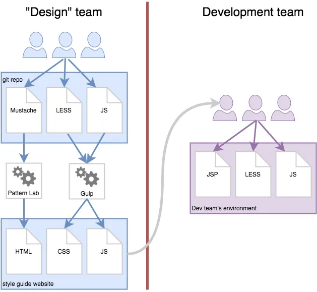
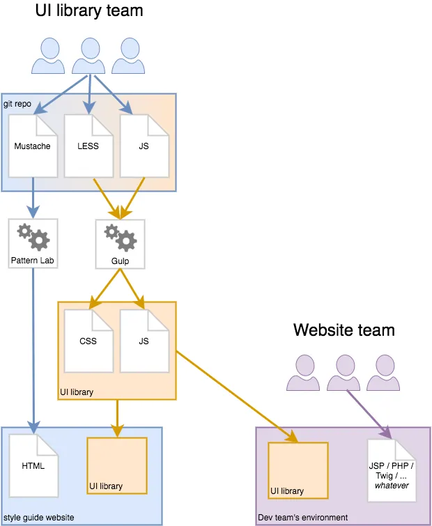
By the middle of this year, we were really hitting our stride with respect to applying Atomic Design and working with Pattern Lab. We were now itching to take it to the next level: Sharing code between the style guide and the real website(s). Or, as Brad Frost puts it, the Holy Grail.
Luckily a couple of new projects — one internal, the other for a client — came along that were the ideal opportunity to give it a go. In both cases, there was no pre-existing website or CMS code we had to work around, so we had a blank canvas and were able to sit down with the developers and hatch a joint plan.
Our first instinct was to see if we could reuse the actual template code across Pattern Lab and the sites. We quickly decided that wouldn’t be practical for us. In both cases, the CMS used a different template language to Pattern Lab. However, the more we thought about, the more we realised that even if our style guide tool and CMS shared a common template language, it might still be unwise to try and share that code:
- You’d be coupling your UI components, which are ultimately just HTML, to a specific technology. CMSes and template languages come and go, but HTML will probably outlive us all. Besides, some of our larger clients often use a variety of different systems for different sites, so there’d never be a single template language shared by them all.
- The way we model data in PatternLab using static JSON files is not necessarily the same as how we’d do it on a live CMS, where the data may come from a database or be programatically generated. Our use of Mustache tags (or the equivalent thereof) might therefore also differ between style guide and website.
That left us with CSS, JavaScript and any core assets required for the styling (icons, background images, font files, etc.). As long as the HTML output of the style guide tool and the CMS were consistent, these could be shared.
Shifting perspective… again
I think popular frameworks like Bootstrap are a great analogy here. Think about how you use them:
- You go to their website,
- download a ZIP with their CSS, JS and assets (or
npm install/bower installit, if you prefer) - and then you write your own HTML following their documentation.
This works regardless of whether you write static HTML files and upload them via FTP, or if you have some snazzy Node.js, containerised system running on the cloud, generating hyper-personalised HTML content!
Instead of trying to make our style guide templates reusable downstream, we instead started thinking of our HTML structures as a sort of API. While we would be “designing” and crafting the desired HTML within the style guide, the rendered HTML was not something to be consumed downstream. It was instead API documentation.
A downstream development team wanting to consume the same CSS & JS simply needs to generate the same mark-up using whatever technology they want. In fact, it’s actually the DOM that needs to match. In principle, you could just as well generate it client-side via React or Angular — as long as the generated elements and attributes match what is expected by the CSS, the correct styles will be applied. (Note: In that scenario, having some shared, upstream JS also interact correctly might be more tricky though.)
Having previously realised that our style guide “design” work more or less amounted to a software development project, we now realised the true nature of what we were building: Not a style guide website, but a custom UI library.
The accompanying style guide website was simply a by-product, a sort of combo of visual catalogue of UI elements and developer API documentation. Coming back to the Bootstrap analogy, it was roughly equivalent to http://getbootstrap.com/components/.
This is the approach we applied to both the internal and the client projects I mentioned above. In both cases it worked pretty well. The benefits were just as we had expected:
- Less duplication of code, meant less work overall. (So timekeepers and beancounters were pleased)
- The websites didn’t look and feel roughly like what was depicted in the style guide website, they looked and felt exactly the same.
Challenges
You’ll notice in the diagram above that the arrows all point in one direction — from the UI library team to the downstream website teams that consume it. This is correct in the sense that the code does flow in that way. However, the reality was that there was also a feedback loop, going in the opposite direction. As the sites were built, issues sometimes arose that we hadn’t anticipated (e.g. the CMS insists on inserting some extra HTML fluff we hadn’t specified in the style guide) which meant that the UI library code had to be amended in some way.
If you’re not careful, and downstream teams just add their own monkey patches to fix issues they encounter, the site and the style guide will diverge. Apart from unwanted visual discrepancies, that can also lead to code incompatibilities over time. What happens when the UI library is updated and extended — will the monkey patches clash with those changes?
Our projects were relatively small scale and we had a close relationship with the website teams, so we agreed from the start that they would not monkey patch and instead raise any such issues with the UI library team who would then adapt the UI library as necessary and release an updated version. This worked for us and there were no major hiccups.
The other challenge you can have is how to handle breaking changes. If each successive update to your UI library is only adding support for new UI components, it’s easy. But consider what happens when you change or remove components. Unless downstream teams update their HTML output accordingly, the look and feel of theirs sites will break when they update to the latest UI library CSS and JS code.
To manage this effectively, you need to:
- Identify when updates to the UI library are breaking changes
- Notify downstream teams that a break has occurred
- Explain to downstream teams, what exactly has changed, so that they know which parts of their code need to be updated.
For our projects, we manually identified the changes. We used version numbers (and chats via a shared Slack channel) to notify the downstream teams of changes. Finally, we included per-version snapshots of our generated HTML in our UI library, so that the downstream could diff them and easily spot the differences.
I’ll elaborate more on this topic in a future post. Suffice to say, it worked well enough and our projects were a success. We established some schemes we like and will use again, but we also got some ideas for how we can automate some of the more manual aspects in future too.
Final thoughts
We’re very pleased with the progress we’ve made in this area. While we knew in our hearts that Atomic Design, web-based style guides and tools like Pattern Lab were the right thing to do as soon as we first heard about them, we now have the experience and evidence to back us up when we need to persuade peers and clients to make use of them.
It’s one thing to “talk the talk”, it’s quite another to “walk the walk”!
Our goal for the next year is go big and seriously scale these ideas up into full-blown design systems. We are fortunate enough to work with some very large organisations, so there are some exciting opportunities to turn this into a reality.
As we do so, we’ll of course share what we learn and figure out along the way. We’re equally excited to read what the wider design system community are doing too — there are new tools, talks and posts appearing almost every day.
There is a lot of uncharted territory here. Come join us!